Why We Started This Project
To provide liberal point of view to think something
Since the client had already owned several services, there was a common point of view such as:
"To support people's challenge of thinking differently"
"To help make their point of view wider"
The aim of this service is to provide some ways to see something from different, the neutral point of view rather than seeing some easy-to-consume information through daily updates, particularly for the business person who is around 30 years old.
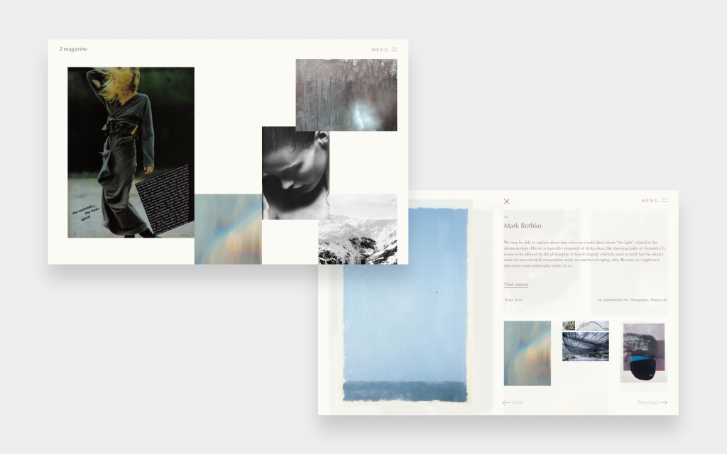
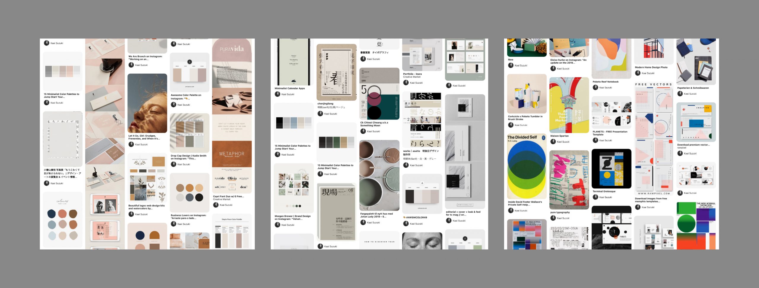
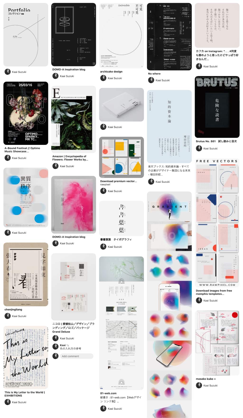
Mood board
The team is composed of 3 people in different cities Vancouver, Saltlake City, and Tokyo. We complete this project as a first product in:
- Design consideration - 2 weeks in total
- Development - 3 1/2 weeks in total
From the first interview with the client, I created 3 kinds of mood boards that might close to the image of the website. We brushed up the boards with discussing and composing a new mood board based on those three.
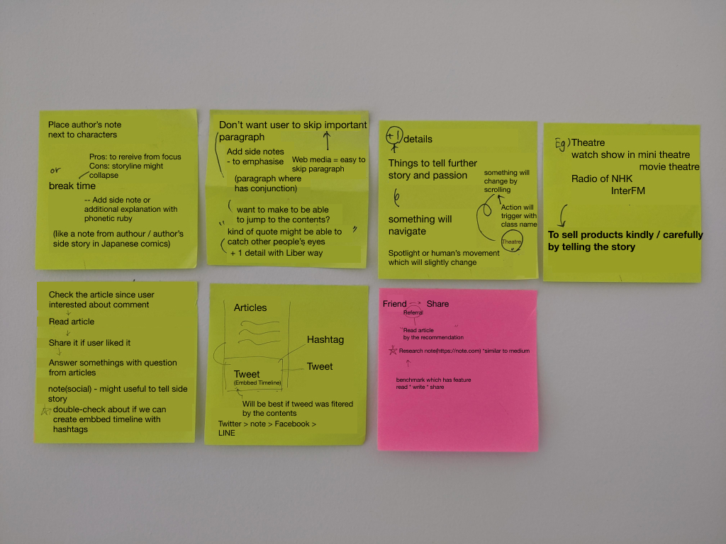
Each of the content is abstract since we wanted users to think deeply and differently like reading books of liberal arts. Therefore, we wanted the users to focus to read each content.
Firstly we thought a visually changing atmosphere is the key to "dive into organic different world" to focus on something.
The auditorium or theatre is a good example of what makes to focus on seeing something.
- inside of the auditorium is surrounded by darkness to focus on seeing something.
- movement of lights and shadows makes us consider what is going on there
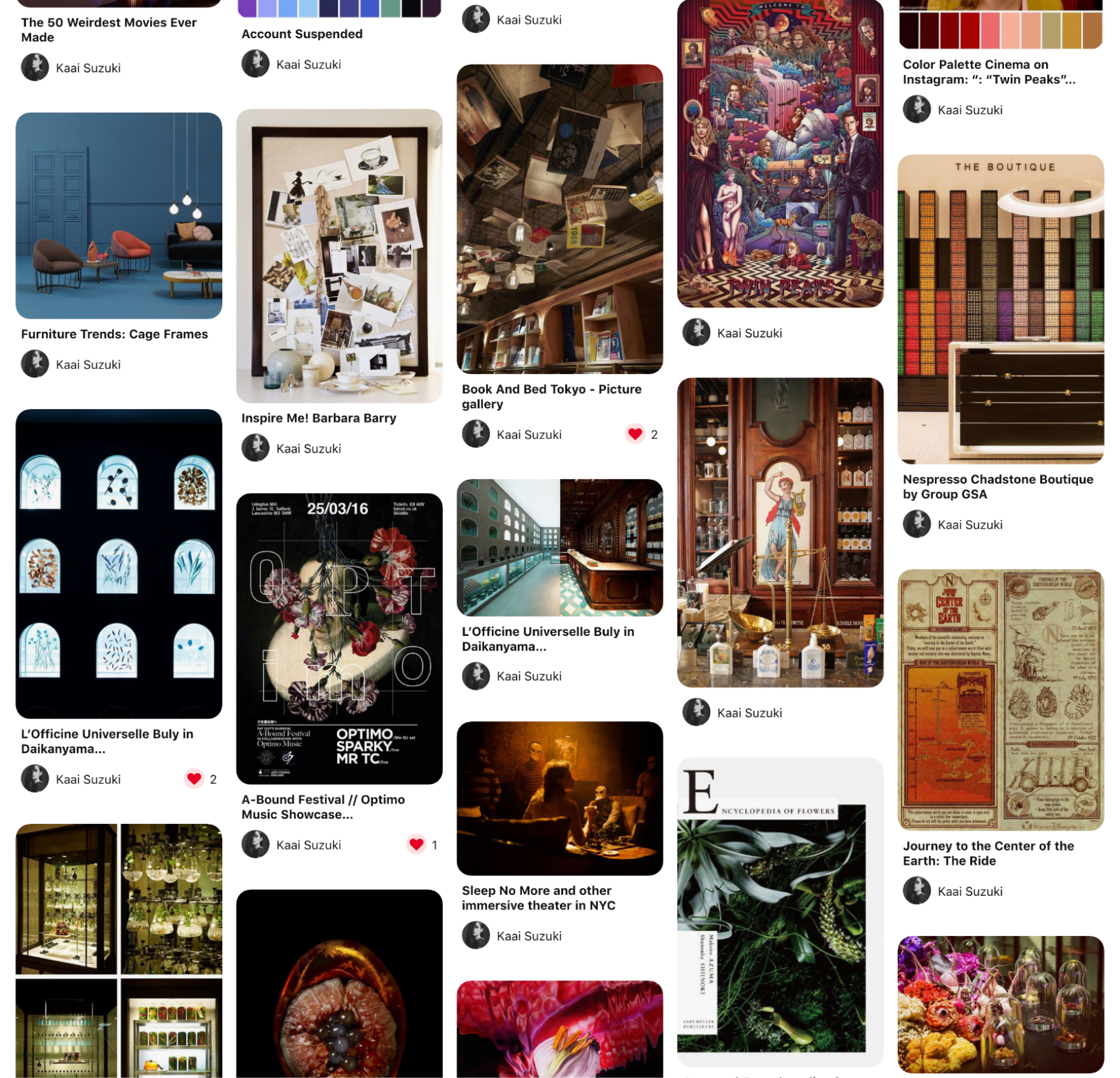
Finally, we added the closest image as an integrated mood board. It has a minimalistic, a little mysterious, and dark atmosphere.
Customer Journey
The main objective of this project is to grow a mature community, which is ahead of marketing. We aim to make and grow some ways to communicate liberally by sharing or posting opinions on the website (as an application), or some specific event that we're going to host.
In Japan, we already have some very good case studies which help to create a new community through some discussion with hosting some specific, cultural events - such as Tsutaya Bookstore as a good example. We created a customer journey map based on the experience in that kind of book store.
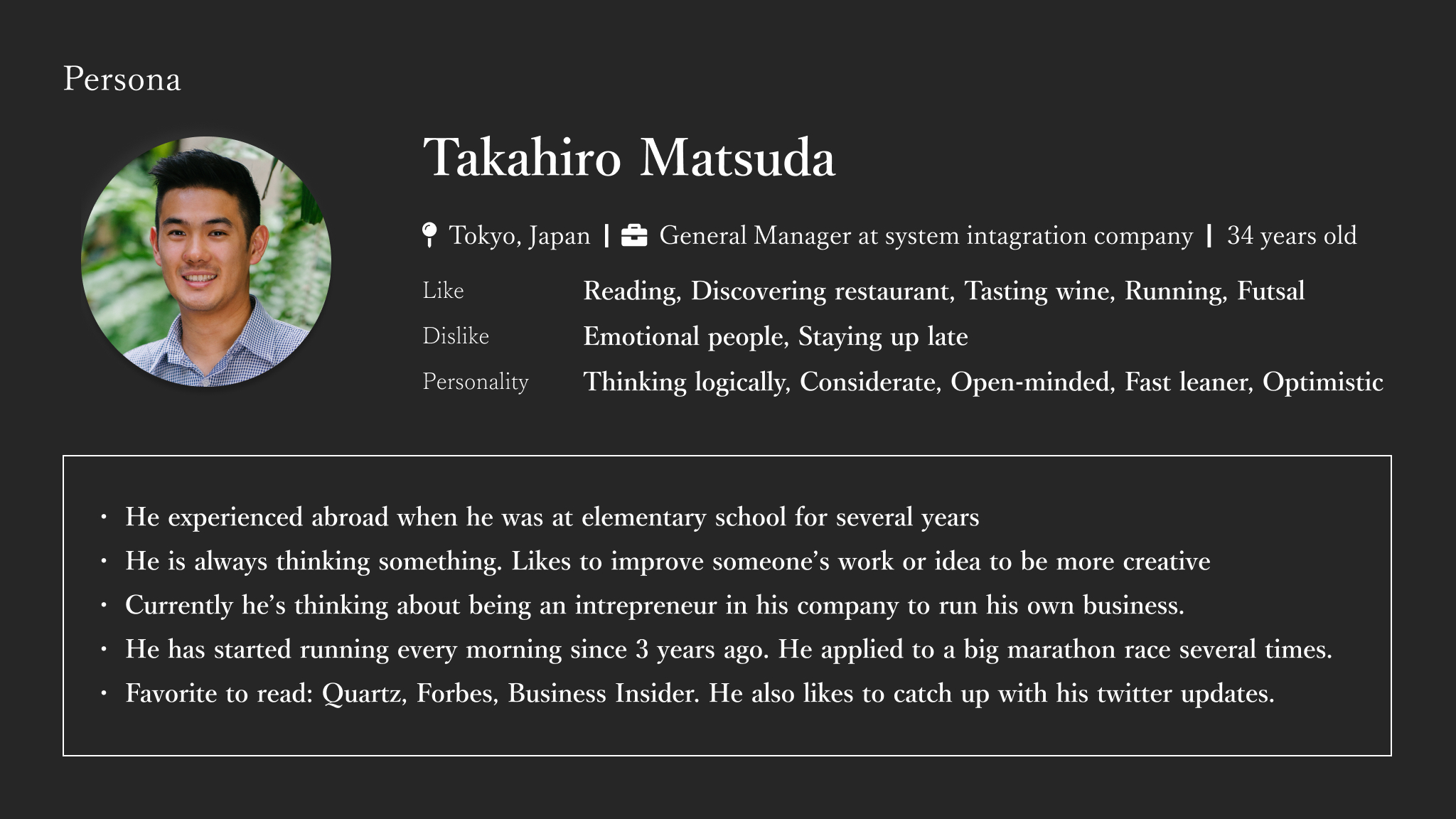
Persona
We also created a persona who is around 33 years old man passionate to product management with thinking business strategy in a system integration company.
- User will be aware of the existence of our service
- Referral from Friend
- Brochures or handouts in the bookstore
- Social media - Twitter or Facebook
- User will look at our website when has a day-off, in the morning, or before go to bed
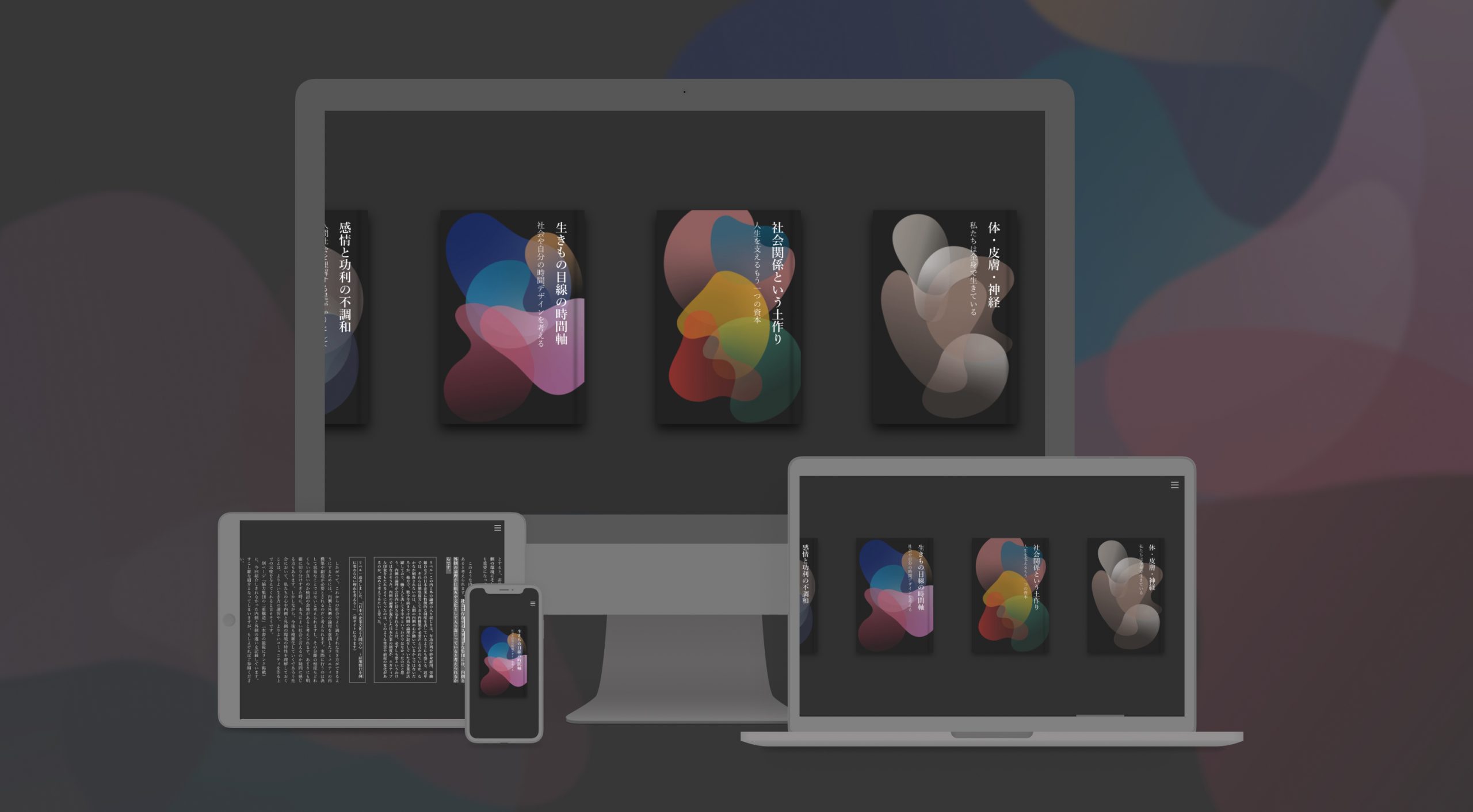
Design
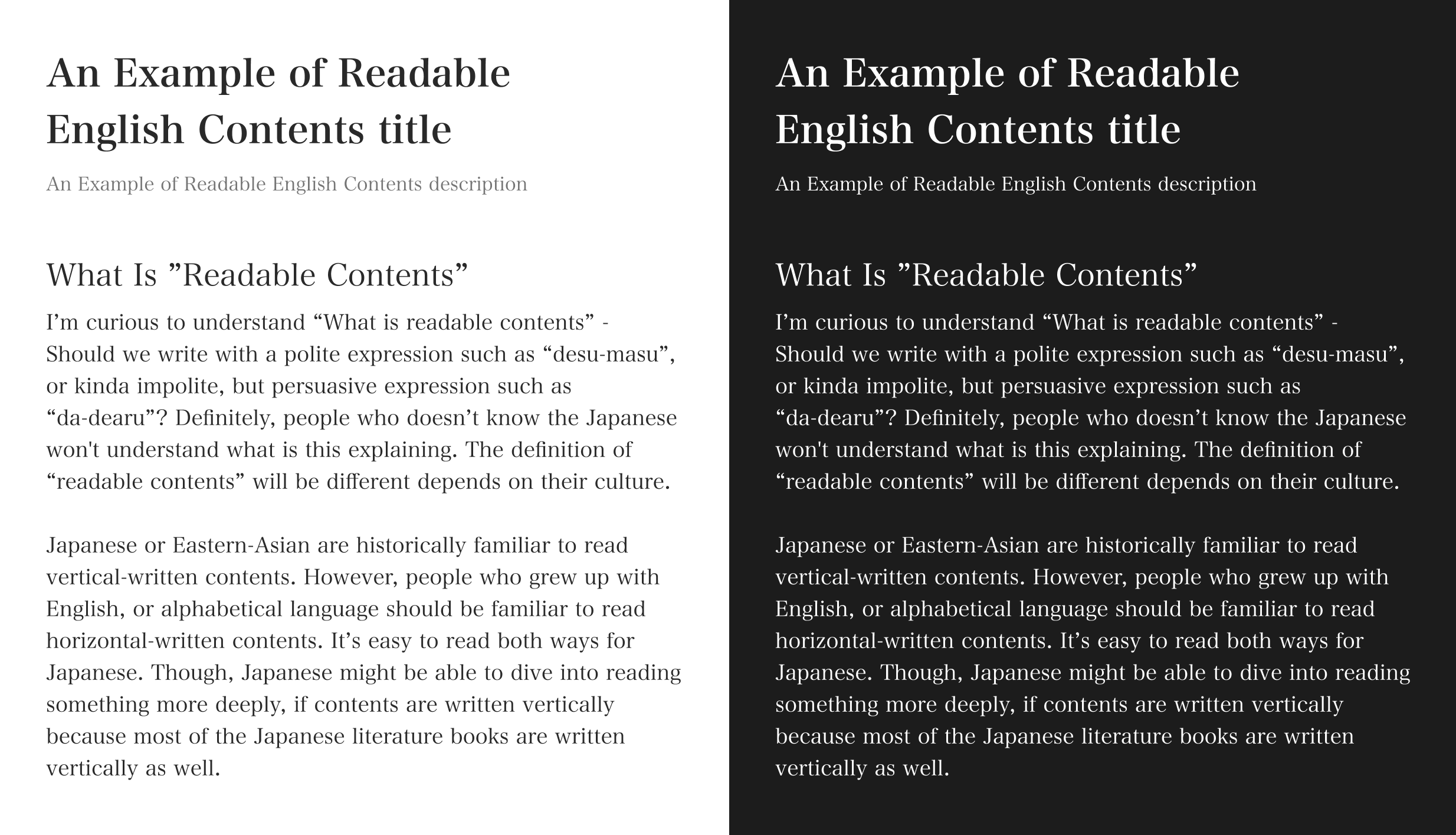
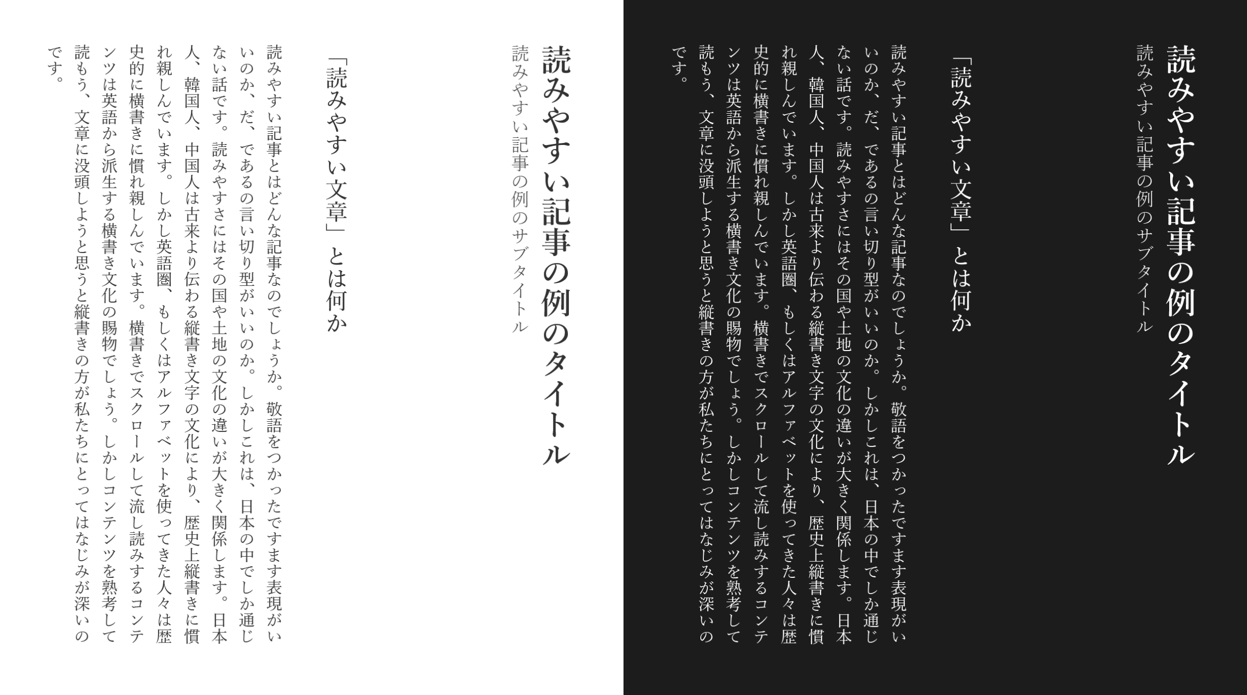
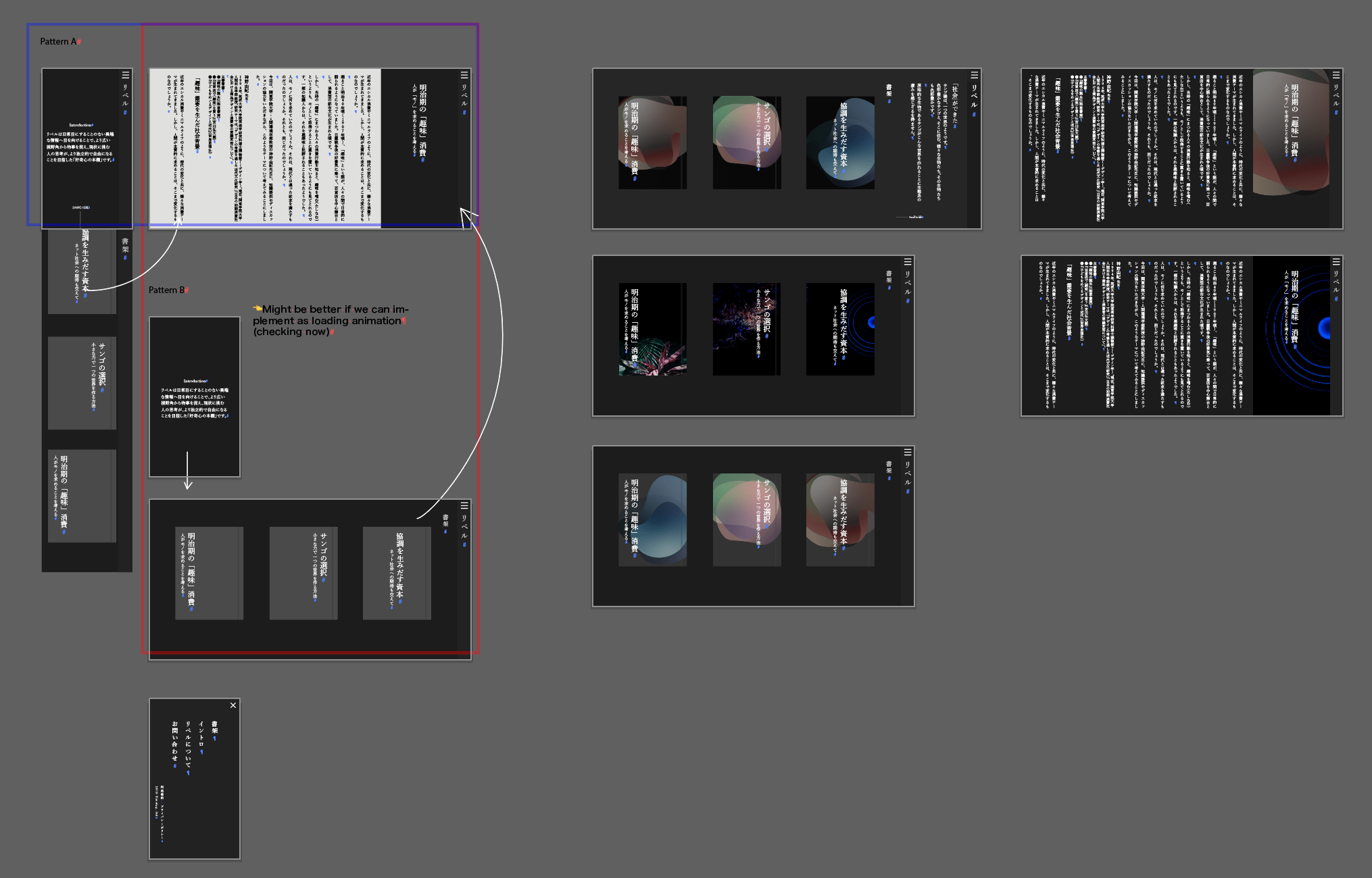
Vertical-written website to make the user dive into reading more deeply
We decided to use vertical-writing to reproduce the experience of reading books in the bookstore since the bookstore and stages were the keywords to dive into another world.
As a result of research, Since we historically get used to reading vertical-written books, users responded that it's easier to read vertical-writing rather than horizontal-writing contents.
We also deeply considered content height, font size, and line-height by comparing many kinds of books.
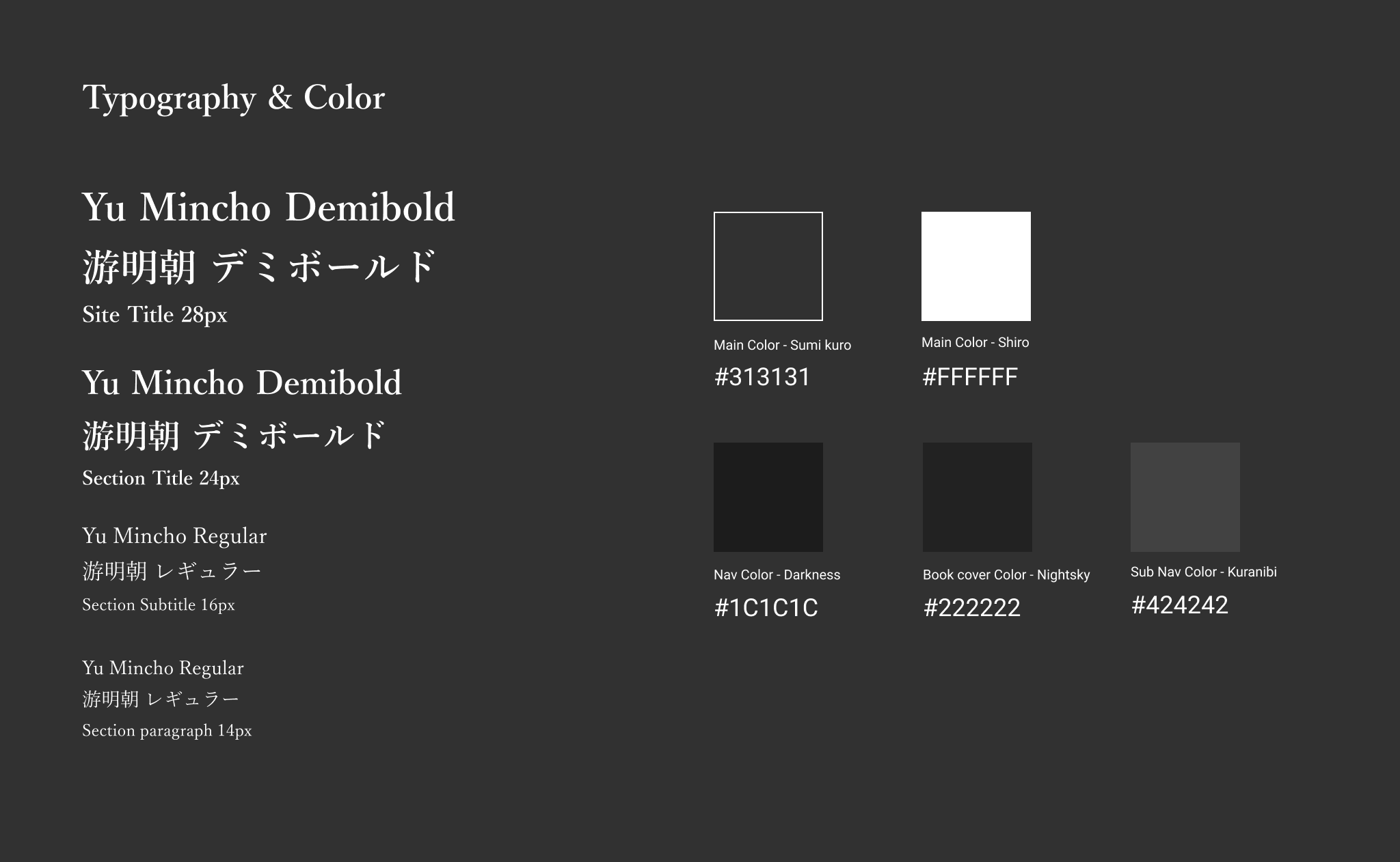
Color and Typography
All the content except thumbnail is using dark grey with different brightness to make the user easy to look at the contents for a long time. It also expresses the darkness which navigates to another world. We use serif font to make the content close to actual paperbacks.
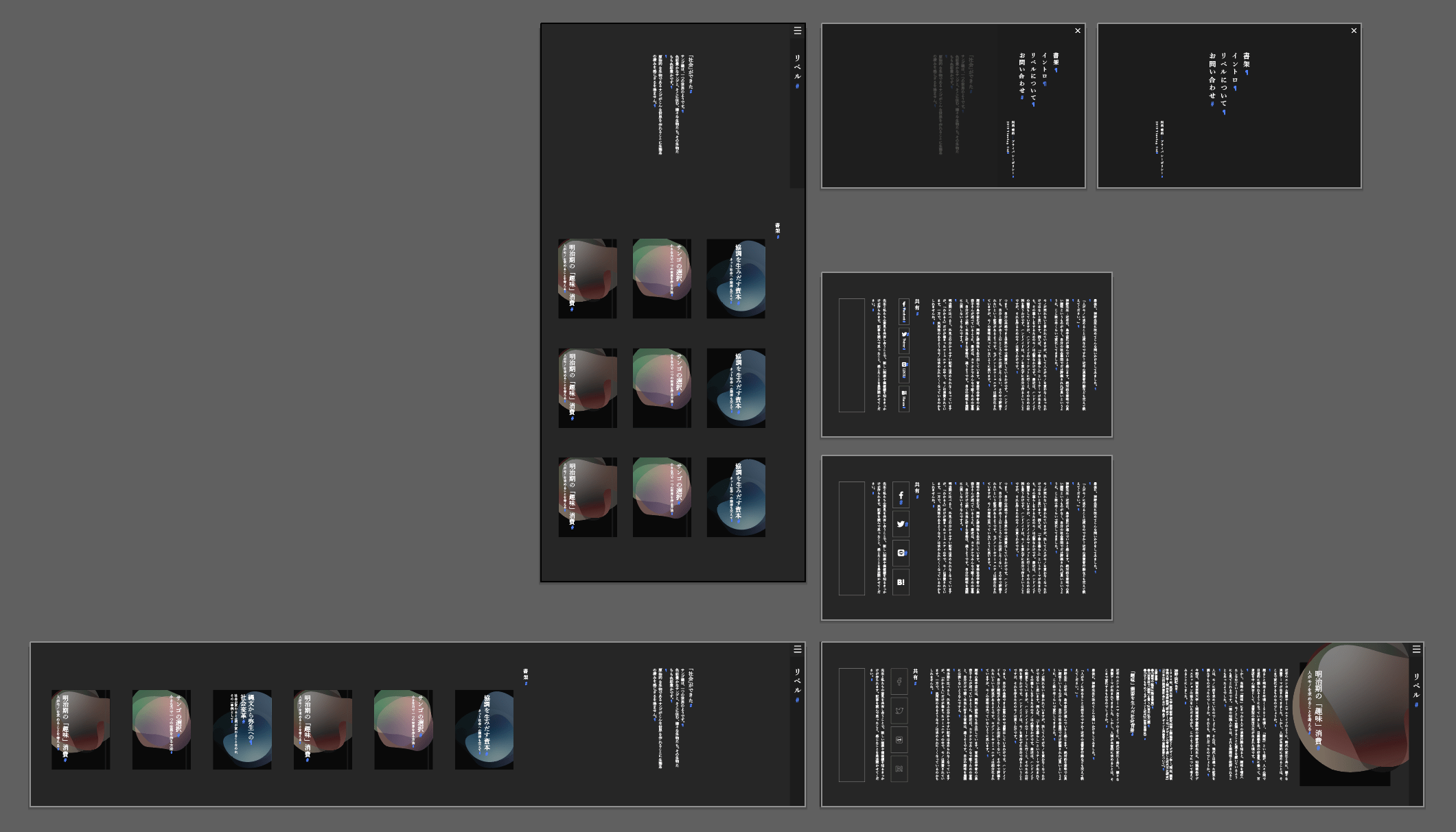
The Final UI
I added some animation in this UI to express and navigate to the different worlds. Darken color makes the user easy to focus on our contents.
Bookcover Artwork - Page Thumbnails
Express "Organic Different World"
To express the keyword "Organic Different World" which we agreed, I also created some cover artwork. this color is randomly chosen from the picture of my daily life. It explains that all the things that we are seeing are changing in various ways without knowing.

Reflection
After launching projects, We noticed that Japanese people are usually struggling to find the place or time to focus something while in the situation such as:
- Standing on the train for around 1 hour to commute
- Working for 12 hours on average
- The weekend is only for taking some rest or for taking care of spouse or child
- They usually needs to have a physical space to learn, read or focus on something, such as school, coffee shop or cybercafe (Internet cafe)
According to Japanese media, apparently some people are using car at parking to focus on something.
Achievements and Next Steps
Today, there is not really popular or specific Japanese media website to introduce or to read liberal arts. Therefore, being someone aware of existing our website is the first step to grow as an organization. To spread this service and to grow community, we start trying to hold some meetups with specific themes along with the contents on the website. Also, we made a small zine to introduce our website as a new virtual book on the internet.
Our community is gradually growing up and spreading by sharing from people to people. Some people shared how they feel, such as "Website to get an experience like reading a real book" as their feedback. I'm keeping continue helping and supporting them to grow the community and to consider marketing strategy more actively.
Credit
- Taiki Yoshida, Hayato Matsuzawa - Product owner from Timelag Co.,Ltd.
- Kaai Suzuki - UI/UX design, Front-end development